SO-Arena: Benchmarking the Capability Spectrum and Reliability of System One Models
A race-day results board in a quiet newsroom, with an ink serif headline carrying one wine and one blue italic word, a top-six results card pinned beside it, and a two-tone ring that spells out the arena's full name when you come near.
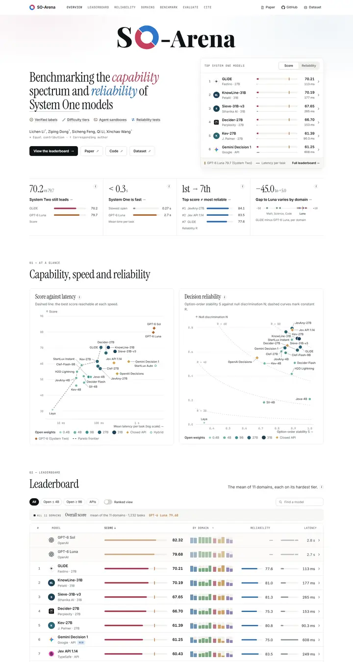
Checked against the rendered page. A hidden 463px domain menu (.dock, absolutely positioned after the footer with visibility hidden but display flex) adds 459px of empty scroll below the footer at every width (scrollHeight 9,290 vs content end 8,831 at 1440). Chart tick labels in #737a81 at 11px reach 4.35:1 on white, and the 12.5px #b0652d 'GPT-6 Luna 79.68' label reaches 4.12:1 on #f7f7f4.
Why it is here
Added on the maintainer's suggestion rather than through the design rounds. The page is for an arXiv preprint with no venue, so it sits outside the venue rules and was not judged in the rounds. It replaces the usual teaser with a top-six results card beside a narrow Instrument Serif title whose two italic words set the page's wine-for-capability and blue-for-reliability code, and its wordmark unfolds from 'SO-Arena' into 'System One-Arena' as the pointer nears the ring.
Overview
Color Palette
Typography
Spacing & Shape
Page Modules
Guidelines
More like this